User Interface
|
|
DeepEnd is designed with a clean, uncluttered user interface
that is consistent and easy to understand. It employs several
common screen objects and interface design features that are
intended to maximize usability and shorten the learning curve.
|
|
|
|
- Adequate Use of Color
Color can be a very effective way of drawing attention
to important items on the screen. But some software
designers get carried away with it in an apparent effort
to make the display "prettier" and, as a result, the colors
really have no significant meaning to the user.
DeepEnd makes relatively modest, but consistent, use of
color to highlight key elements without making the display
too "loud". All color schemes are designed for comfortable
readability.
|
|
- Modeless Design
"Modal" interface designs enable you to work with only
one part of the program, such as Purchasing or Billing,
at one time. Such a design requires you to "go into" each
part of the program and exit that part before you can go
into another part. This design reduces productivity.
DeepEnd employs a "Modeless" design which, while more
complicated to develop, provides far more capability by
enabling several windows, each accessing a different part
of the program, to be open at once. You can
easily switch between windows and also open new windows at any
time.
Many of the data maintenance forms can have several instances
open in the same session. For example, you can have 3 different
Service Jobs open at the same time and switch back and forth
between them.
|
|
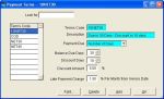
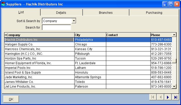
- Data Maintenance Forms
Data Maintenance Forms.
- Standard Forms
These forms are typically used for simple data tables
and picklist maintenance. The navigation grid lists
all of the records in the data table and provides
sort and search capability. As the record pointer
is moved in the grid, the textboxes and other data
objects on the form are refreshed with the data from
the selected record.
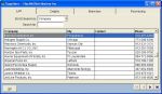
- Multi-Page Forms
These froms are similar to Standard Forms but are
designed to handle larger, more complex data sets.
They have at least 2 pages and the navigation grid
is located on Page 1.
These forms also provide the abilty to filter the
records displayed by enabling you to define specific
selection criteria. This Record Filtering feature
is described in more detail below.
|
|
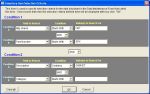
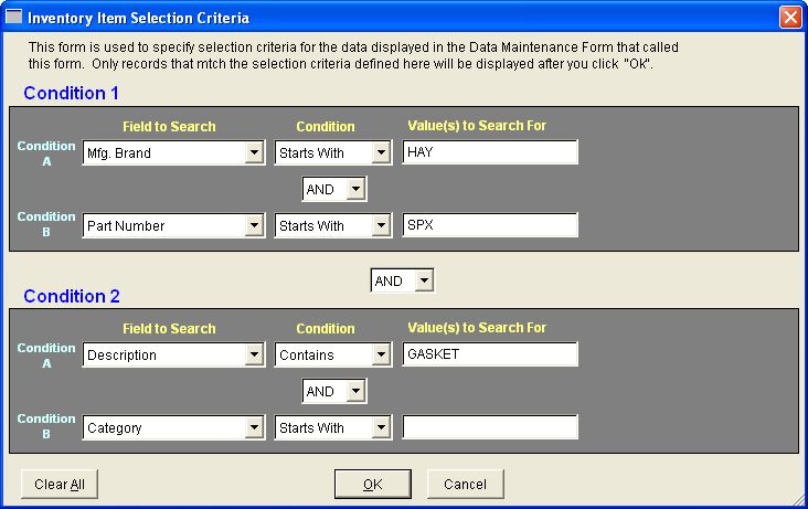
- Record Filtering
DeepEnd provides a very powerful, yet simple, Selection
Criteia form that enables you to filter the records that
are displayed in multi-page data maintenance forms.
Simply select the field to search, enter the value to
search for and select the relational operator to specify
how to search for the value in the selected field.
You can select up to 4 fields to search and also specify
AND/OR conditions between those fields to make the
search a more refined.
|
|
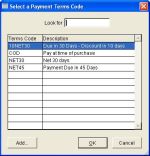
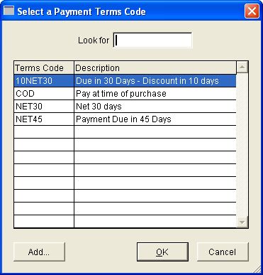
- Pick List Forms
Pick List Forms are used extensively throughout DeepEnd
to make data entry easier, faster and more consistent by
enabling you to select a value from a list without having
to type it in.
Some picklists allow one item to be selected while some
others allow several items to be selected. Some picklists
also provide "Add-on-the-Fly" capability.
|
|
- Special Form Controls
There are several form controls used throughout DeepEnd
that provide special functionality.
- Pick List Textbox
This textbox validates your input against a lookup table
and automatically fills itself in with the table value
found that matches what you have typed so far. It also
displays a Pick List if an invalid entry is made.
The Pick List can also be summoned by pressing a "hot key"
or by clicking the pick list button.
It is designed to provide consistent data entry and
save key strokes.
- Auto-Fill Textbox
This is the same as the Pick List Textbox except that
entries not found in the lookup table are allowed.
- Date Textbox
This text box is formatted specifically for dates.
It also displays a pop-up calendar from which you can
pick the date rather than type it in.
- Additional Notes Button
DeepEnd provides an Additional Notes field
for every significant data table. This Notes button
displays an edit window in which to display/edit
the text contained in the notes field.
If there is any text in the notes field, the Notes
button caption color is set to blue to indicate that
the notes field is not empty.
- User-Defined Field Labels
There are several User-Defined fields throughout
DeepEnd that can be easily identified
by their dark blue colored labels. The label
text can be changed by double-clicking the label
and entering the new text.
- Required Fields
During data entry, some information must
be entered to assure data integrity. Form controls
that contain required information are colored
Cyan to make it easier to identify them as
being required fields.
|
|
|
|
Key Features Summary
|
Back to Top
|
- Large, easy-to-read fonts
- Non-offensive color schemes
- Standard style menus and toolbars
- Modeless user interface. No need to exit the current task to perform another
- Standardized data maintenance forms with consistent behavior
designed for minimal mouse movement
- Record drilldown capability throughout for easy "fact-finding"
- Powerful, flexible record filtering
- Extensive use of picklists with "Add-on-the-Fly" capability
for ease of use and consistent data entry
- Convenient custom form controls for increased productivity
|


 P.O. Box 58, Hampton, ON, Canada L0B 1J0